When you design a kitchen, you’re not only thinking about how it looks. You’re thinking about how someone will actually live in it. Where they’ll stand while chopping veggies, how drawers will open when hands are full, how light will shift from morning to evening. You design an experience, not just a look. Whether it’s a kitchen, a showroom, or an entire home, the best spaces feel effortless, because they were created with intention.
Your website needs that same level of thought. For many homeowners, it’s the first place they move through. Before they ever step into your showroom, they’re scrolling through your homepage, forming an impression of your work and what it might feel like to work with you.
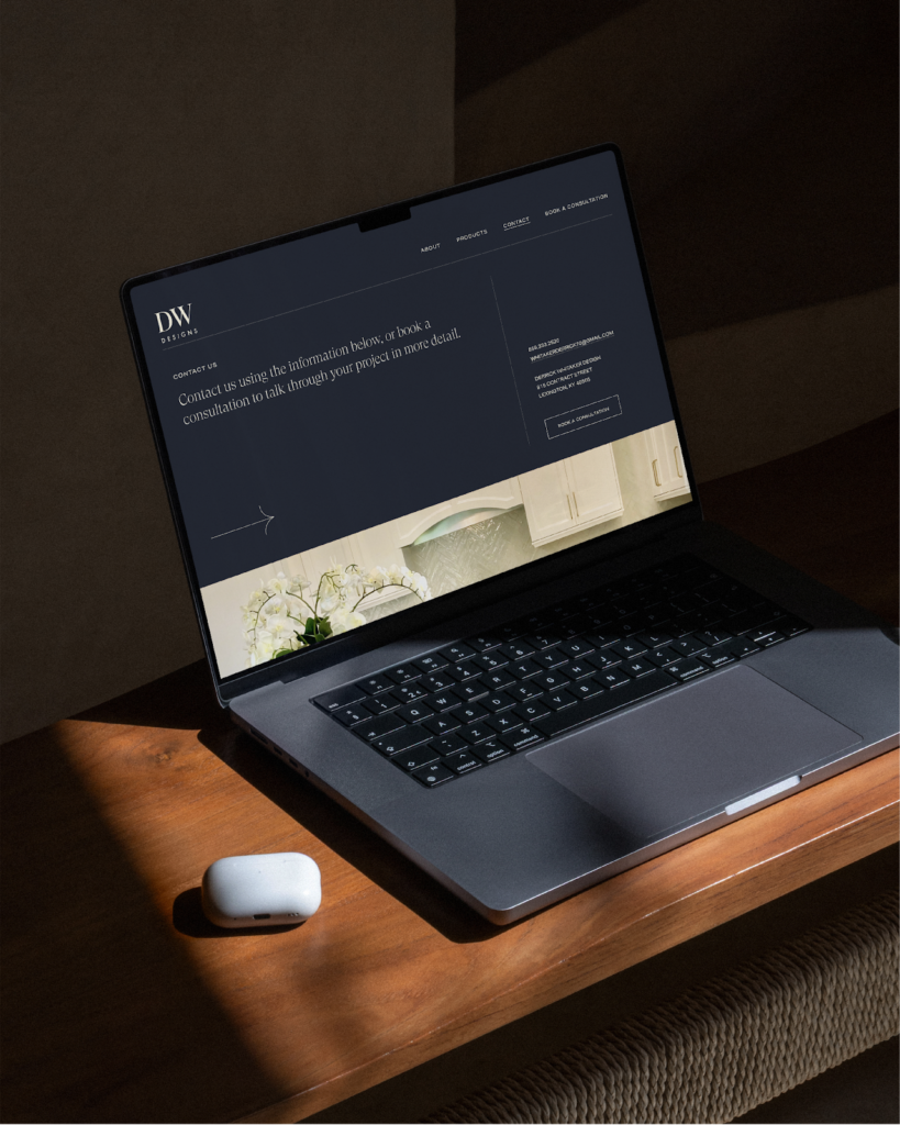
Today, most home projects begin online. Late at night, on a phone or laptop, they move between Pinterest boards, Google searches, online reviews, and dealer websites. Long before they step into your showroom, they’re stepping into your website.
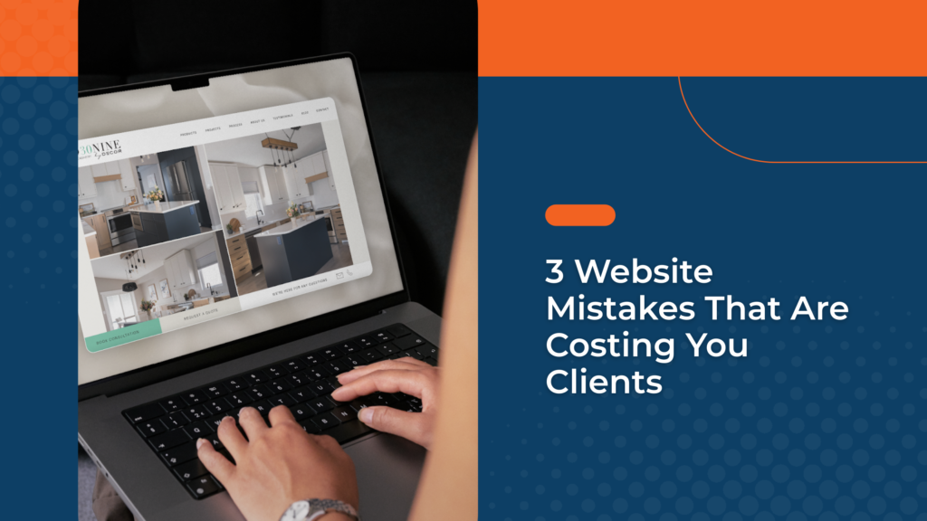
Your website is an extension of your craftsmanship
It should have the same intention and clarity you bring to the spaces you design. A strong website does more than look polished. It flows naturally, feels aligned, and functions with purpose.
1. Poor flow creates friction
In any well designed space, flow determines how someone moves. In a kitchen, it’s the movement between sink, stove, and fridge. Thoughtful design is what separates seamless from awkward.
On a website, it’s the same idea. Flow shapes what someone sees first, what question gets answered next, and how easily they can move from curiosity to confidence. When it’s done well, people don’t notice it. They simply move forward.
Flow = structure. Good flow looks like:
- Clear hierarchy that prioritizes what matters most and answers key questions in the right order
- Strategic messaging placement that introduces who you are before diving into product details
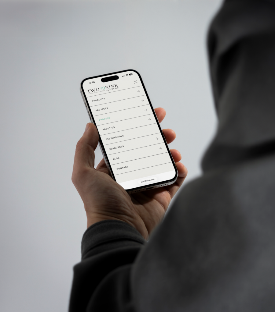
- Logical navigation that makes it obvious where to go next
- A guided path that moves someone from interest to inquiry
Poor flow looks like a phone number buried in the footer, a Contact page that takes three clicks to find, or a gallery full of beautiful photos with no context and no clear next step when someone reaches the end.
Flow is also about timing. People don’t land on your site ready to inquire. They’re first trying to figure out: Do I like their work? Do they do what I need? Can I trust them? And only then, how do I start?
When your process is unclear, people hesitate. When your messaging is generic, they can’t see what makes you different. When they have to hunt for the next step, they leave.
2. A disjointed feeling undermines trust
Structure creates the path, but feeling is what builds confidence.
In a space, details set the tone. Warm wood or high-gloss white. Matte black or brushed brass. Traditional and layered or clean and minimal. These choices communicate personality.
Websites work the same way. Fonts carry tone. Colour sets mood. Imagery signals quality. Language reveals perspective. When the feeling of your website doesn’t match the soul behind your brand, something feels off. That disconnect shows up in small (but telling) ways: outdated project photos that don’t reflect your current level of work, stock imagery that looks nothing like the spaces you design, or a refined logo paired with a site layout that feels generic or templated.
If your in-person experience feels polished but your website feels dated, people notice. Even if they can’t put their finger on it, they feel it.
When what they see online matches what they’ll experience in person, it feels consistent and that makes people more comfortable reaching out.
3. Weak function kills momentum
A beautiful space that doesn’t function becomes frustrating. Same with a website. If it isn’t turning interest into inquiries, it isn’t doing its job.
Function is what makes taking the next step feel easy. It comes down to a few basics:
- Is it obvious what to do next?
- Can they reach out quickly?
- Does it load fast, especially on mobile?
- Does anything feel like a hassle?
Practically, that means clear calls to action, a short and simple contact form, and contact info that’s easy to find. It also means performance. Pages that load fast, images that are optimized, and a mobile experience that feels just as considered as desktop since many homeowners are making that first decision from their phone.
If booking takes too many steps, forms feel like homework, or if it’s unclear what happens after someone reaches out, momentum gets lost again. The goal is simple: remove friction wherever you can.
When flow, feeling, and function work together, your website becomes an extension of your craftsmanship.
And when you invest so much care into the spaces you design, your digital space deserves the same.
Through Decor Marketing Solutions, dealers have access to website support designed to help their online presence better reflect the quality of their work.
If your current site doesn’t reflect the quality of your work, we’d be happy to help. We specialize in building strategic, intentional websites for Decor dealers that support real growth.
Explore the Decor Dealer website program here: capari.co/decor-dealers